Comprehensive Coverage
Role
UI/UX Designer
Employer
TheGuarantors
Tools
Figma Figjam Procreate Adobe Illustrator
Team
Design Marketing Product QA
Timeline
2022-2023
Context
Translation of Rebranded Style Guide into a usable library of digital assets and design system, while also expanding the brand language for both internal and external purposes.

What’s the problem?
Before rebranding, TheGuarantors had been operating with outdated and disjointed branding styles, both internally and externally. By telling a different story with each and every product, this caused an overflow of CS inbound as well as a general distrust of the product.
From the product flows, payment portals within these flows and email marketing — all had different graphic styles and inconsistent language. In order to position the product as a desirable B2B tool and create trust with their client base, TheGuarantors hired a design firm to rebrand their look.
As designers, it was our job to translate this style guide into a workable design system and cohesive product universe.


Let’s start with the basics
Starting with the design system, our team took the firm-provided Brand Style Guide and marketing pages, via Contentful (shown below), and broke it down into functioning components. This was included, but was not limited to:
Typography
Icons
Cards
Data grids
Input fields
Loading animations
Branded graphics (collages)
Buttons
This is a system capable of evolution and adaptation to suit product needs. The Introduction of new internal tools as well as user-facing dashboards required an expansion of the systems' data grids, drawers, and color usage.


Expanding the brand language
The provided icons were limited in both individual units and functionality. I met with our team's designers and determined which icons were still needed. These were then built to comply with brand guidelines, designing them in Illustrator before transferring them into Figma.
This served to create a language within both the product and TheGuarantor's internal processes. The icons shown here include the user-facing products (Renters Insurance, Deposit Coverage, Rent Coverage, CS Chatbot) and internal usage (User personas, Presentations, etc).
Below — Illustrator working file + Style guide reference


Below are examples of collages – the main graphic element in TheGuarantor's toolkit – and the types of cards used in various areas of marketing pages and product flow.


Collage Samples

Customizable Dropdown

Marketing — Conference Ad

Testimonial
What does this look like in practice?
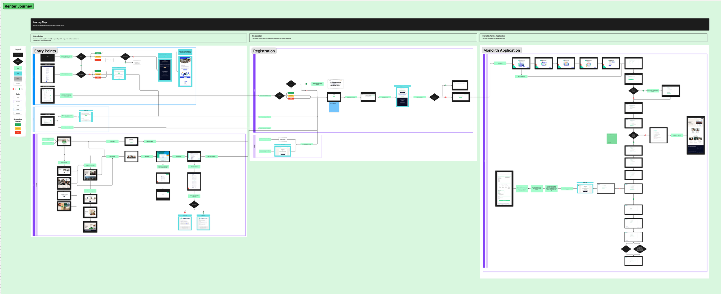
Mapping the journey
Discovery was needed before product flows could be rebranded. To understand what we were working with, it became necessary to map out the product flow and user journey.
At the time, there had been no concerted effort to map out the product flow or user journey. Time was spent working cross-functionally during this discovery phase to gather every bit of literature and touchpoint the user had with the product. The disconnected nature of the teams had caused a distinct lack of understanding when it came to the product flow. The maps we created were beneficial, not only to the designers, but to the entire organization as a method of deepening the functional understanding of the product.
An initial dive into the product and page inspection, etc., then allowed us to create a streamlined user journey (below) with clear entry points. This could then be used for future product road maps.


At the time there was no official process for external teams to interact, communicate, and work with Design, so the need to map out our development journey was obvious. I was able to map out cross-functional timelines and touch points with the help of our UX Researcher. We integrated the RACI system (Responsible, Accountable, Consulted, Informed) to account for the nuances of cross-team interactions and collaboration. After this was implemented, we were able to include relevant research in order to streamline our processes, focusing on best practices and tweaking decision making paradigms to improve product lifespan.

The design process
The purpose of discovery is to gather conclusive data to optimize synthesis and conclusion. The same could be said about my design philosophy. In my experience, it is good to begin with more variation explorations than strictly necessary. The focus should be on using the problem to identify a solution.
Here we have the old branding of the product and the iterations I explored during this process. I began by utilizing some components from the old branding and re-skinning them with the new.Then, I move away from old elements to explore a variety of interactions. My goal is always to find the best, most streamlined, solution for the user experience.

Auto UW flow — Phases + Exploration


Before

After
Pushing to product
Due to limited resources and the looming busy season (May-September), the rebrand had to be pushed incrementally. Ultimately, the rebranded versions of our products were built and can now provide an improved, cohesive, streamlined experience for all users.


We also rebranded existing admin portals and built new internal tools, including dashboards for our Small-to-Medium Business clients and various third party tools.
Just for kicks —
An exciting part of the process — company swag.
I was able to design the Technology org’s team (aka “pod”) logos, company stickers, and t-shirts. I consulted our engineers for some light-hearted input and was able to create something that the team felt excited about.


Pod Stickers V1

Pod Stickers V2

Pod Stickers V3 - Final (Team Puma)

Tech Org Stickers
Tech T-Shirt - Iterations

Tech T-Shirt - Final
